Understanding MUI packages
An overview of MUI's packages and the relationships between them.
Overview
- If you want to build a design system based on Material Design, use
@mui/material. - If you want to build with components that give you complete control over your app's CSS, use
@mui/base. - For CSS utilities to help in laying out custom designs with Material UI or Base UI, use
@mui/system.
Glossary
- install refers to running
yarn add $moduleornpm install $module. - import refers to making a module API available in your code by adding
import ... from '$module'.
MUI packages
The following is an up-to-date list of @mui public packages.
@mui/material@mui/base@mui/system@mui/styled-engine@mui/styled-engine-sc@mui/styles
Understanding MUI's products
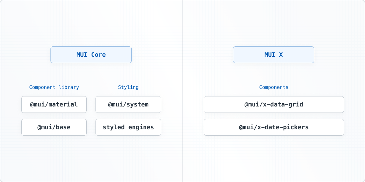
As a company, MUI maintains a suite of open-source and open-core React UI projects. These projects live within two product lines: MUI Core and MUI X.
The following chart illustrates how MUI's packages are related to one another:

In this article, we'll only cover the MUI Core packages. Visit the MUI X Overview for more information about our collection of advanced components.
Component libraries
Material UI
Material UI is a comprehensive library of components that features our implementation of Google's Material Design.
@mui/system is included as dependency, meaning you don't need to install or import it separately—you can import its components and functions directly from @mui/material.
Base UI
Base UI is our library of "unstyled" components and hooks. With Base, you gain complete control over your app's CSS and accessibility features.
The Base package includes prebuilt components with production-ready functionality, along with low-level hooks for transferring that functionality to other components.
Using them together
Imagine you're working on an application that uses @mui/material with a custom theme, and you need to develop a new switch component that looks very different from the one found in Material Design.
In this case, instead of overriding all the styles on the Material UI Switch component, you can use the styled API to customize the Base SwitchUnstyled component from scratch:
<span class="token keyword">import</span> <span class="token punctuation">{</span> styled <span class="token punctuation">}</span> <span class="token keyword">from</span> <span class="token string">'@mui/material/styles'</span><span class="token punctuation">;</span>
<span class="token keyword">import</span> SwitchUnstyled<span class="token punctuation">,</span> <span class="token punctuation">{</span> switchUnstyledClasses <span class="token punctuation">}</span> <span class="token keyword">from</span> <span class="token string">'@mui/base/SwitchUnstyled'</span><span class="token punctuation">;</span>
<span class="token keyword">const</span> Root <span class="token operator">=</span> <span class="token function">styled</span><span class="token punctuation">(</span><span class="token string">'span'</span><span class="token punctuation">)</span><span class="token punctuation">(</span><span class="token template-string"><span class="token template-punctuation string">`</span><span class="token string">
position: relative;
display: inline-block;
width: 32px;
height: 20px;
& .</span><span class="token interpolation"><span class="token interpolation-punctuation punctuation">${</span>switchUnstyledClasses<span class="token punctuation">.</span>track<span class="token interpolation-punctuation punctuation">}</span></span><span class="token string"> {
// ...css
}
& .</span><span class="token interpolation"><span class="token interpolation-punctuation punctuation">${</span>switchUnstyledClasses<span class="token punctuation">.</span>thumb<span class="token interpolation-punctuation punctuation">}</span></span><span class="token string"> {
// ...css
}
</span><span class="token template-punctuation string">`</span></span><span class="token punctuation">)</span><span class="token punctuation">;</span>
<span class="token keyword">export</span> <span class="token keyword">default</span> <span class="token keyword">function</span> <span class="token function">CustomSwitch</span><span class="token punctuation">(</span><span class="token punctuation">)</span> <span class="token punctuation">{</span>
<span class="token keyword">const</span> label <span class="token operator">=</span> <span class="token punctuation">{</span> <span class="token literal-property property">slotProps</span><span class="token operator">:</span> <span class="token punctuation">{</span> <span class="token literal-property property">input</span><span class="token operator">:</span> <span class="token punctuation">{</span> <span class="token string-property property">'aria-label'</span><span class="token operator">:</span> <span class="token string">'Demo switch'</span> <span class="token punctuation">}</span> <span class="token punctuation">}</span> <span class="token punctuation">}</span><span class="token punctuation">;</span>
<span class="token keyword">return</span> <span class="token tag"><span class="token tag"><span class="token punctuation"><</span><span class="token class-name">SwitchUnstyled</span></span> <span class="token attr-name">component</span><span class="token script language-javascript"><span class="token script-punctuation punctuation">=</span><span class="token punctuation">{</span>Root<span class="token punctuation">}</span></span> <span class="token spread"><span class="token punctuation">{</span><span class="token operator">...</span>label<span class="token punctuation">}</span></span> <span class="token punctuation">/></span></span><span class="token punctuation">;</span>
<span class="token punctuation">}</span>
Styling
Styled engines
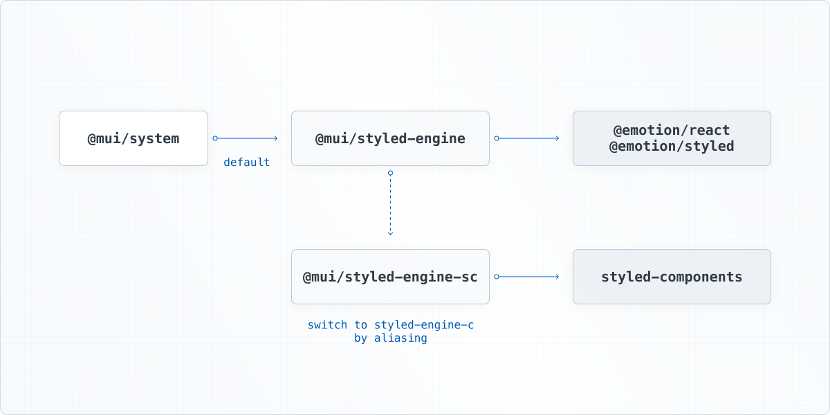
Material UI relies on styling engines to inject CSS into your app. These engines come in two packages:
@mui/styled-engine@mui/styled-engine-sc
By default, Material UI uses Emotion as its styling engine—it's included in the installation process.
If you plan to stick with Emotion, then @mui/styled-engine is a dependency in your app, and you don't need to install it separately.
If you prefer to use styled-components, then you need to install @mui/styled-engine-sc in place of the Emotion packages.
See the Styled engine guide for more details.
In either case, you won't interact much with either of these packages beyond installation—they're used internally in @mui/system.
MUI System
MUI System is a collection of CSS utilities to help you rapidly lay out custom designs.
It uses the Emotion adapter (@mui/styled-engine) as the default style engine to create the CSS utilities.
Advantages of MUI System
- You have full control of the
themeobject. - You can use
sxprop normally as thestyledAPI supports it by default. - You can have themeable components by using
styledvia slots and variants.
